Resources
About Colour
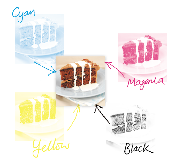
CMYK (process) colour
Your computer, scanner, digital camera and monitor create images using combinations of just three “RGB” colours: Red, Green & Blue.
Printing presses use four different colours to print these images: Cyan, Magenta, Yellow & Black. This set of inks is know as “CMYK “, or “process colour”.
Converting to CMYK
At some stage of production, RGB images and colours must be converted to CMYK.
Your PDF file needs to be supplied in CMYK process colour, not RGB, Index or as Spot Colours. When converting to CMYK be aware that some RGB and Spot Colours don’t have a direct CMYK conversion, and thus some colour shift may occur.
Conversions on images from RGB to CMYK are best done using software such as Photoshop and you should do this before sending your file to us.
Screen versus Print
Due to the differences between a computer screen and a printed item what you see on your screen may be different to your printed product. This is because computer screens have light showing from behind them whereas paper doesn’t.
Be careful with colour
To create a good solid black, use rich black instead (100% Black & 40% Cyan). Don’t use four-colour black and it’s best to avoid solid colours of only one ink (i.e. pure cyan, magenta, yellow or black) as these can be susceptible to slight “banding”. Using rich black avoids banding.
You’ll get best reproduction from colours that are made up from one or two inks (i.e. magenta and cyan etc). When using lighter shades, avoid tints that contain less than 5% of either Cyan, Magenta, Yellow or Black, as they usually print much lighter than they appear on screen and you may be disappointed with the outcome. For best results, use tints containing 5% to 30%.
Getting the best from CMYK
Try to avoid large areas of the same colour – that’s where colour issues (banding, ghosting etc.) becomes most noticeable. Try to break up large areas of colour with alternate elements or add a background image. Vignettes, or gradient fills are best avoided – they have a tendency to show ‘banding’ and look unprofessional. The Adobe® website offers some advice on gradients if you wish to use them.
Colour Tolerances
You can produce fantastic results with full colour process – and without breaking the bank. It pays to bear in mind that colour variation is inherent in any print process and you shouldn’t expect a perfect match to your chosen colour. The examples below will give you an idea of how your chosen colour may actually look when printed.We’d be delighted to explain this in more detail – just ask.
Ink Levels
To get the most from your print, we have set some recommended maximum ink levels. For coated papers (such as business cards, flyers and leaflets) we recommend a maximum of 300% total ink coverage. For uncoated papers we recommend a maximum of 225%.